Thursday, October 20, 2011

Federal Reserve Capital Management

Is the Federal Reserve essentially a giant hedge fund? Can it fail?

Check out this new essay (Click Here), which explores the Fed's role within the context of financial stability/instability in markets. Included are primers on endogenous money and chaos theory vs. neoclassical models in quantitative finance.

Monday, October 10, 2011

Private Domestic Investment and Real Economic Growth: Why the Dearth?

RealGDP Jun 11

RealPrivInvest Jun 11

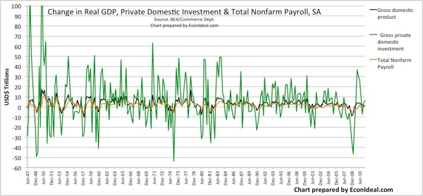
Those connected with econometric data are all too aware of the first chart. Less attention and focus goes to the components of real gross domestic product (GDP) and their trends, particularly private domestic investment (PDI), which historically leads to real economic growth and job creation. The correlation for this comes from looking at the change in real GDP, which responds to changes in PDI [1].

The historical trend for PDI has been relatively weak and muted, despite its multiplier effects on real growth and jobs. The period of the greatest compounded annual growth rate (CAGR) in PDI since 1947 occurred from June 1992 to June 2000 (9.3%; $985B to $2.01T). At the same time, growth in government expenditures was relatively flat (1.4%). Speaking to our trade deficit crisis, net exports (exports-imports) increased negatively at a CAGR of -36.6% (-$36B to -$439B). Personal consumption grew steadily (4.2%) with real GDP growth (4.0%), confirming the moniker "consumer-driven economy."

Since the "prolific" 1992-2000 period, the trend has reversed on PDI. From June 2000 to June 2011, PDI shrank with a negative CAGR of -1.1%, and the current value is stuck at around 2001 levels. While it is true that real GDP and the components kept growing until the 2006-7 pop in the mortgage bubble, PDI has not robustly recovered since the 2008 plunge. A large contributor came from the plunge in residential fixed investment, which we may classify as synonymous with personal consumption, given the hefty progression of homebuyers and speculators that took on mortgage debt and refinancings to finance further consumption. But what about nonresidential fixed investment? Why is it not showing healthy robust growth? Embarrassingly, government expenditures have outpaced at a 1.6% CAGR, and real GDP and employment remain flat to down.

What are the plausible causes of the dearth in PDI, specifically the contributions coming from nonresidential fixed investment? I provide a list below, which is by no means complete:

  • Government regulations are too many, too costly, without justifiable cost benefits
    • EPA, Labor Dept (employment regulations), Sarbanes-Oxley, Dodd-Frank, ...
  • Monetary and tax policies support/induce consumption/speculation, not investment (nonresidential PDI) that leads to solid job creation
    • Zero interest rate policy (ZIRP) and quantitative easing (QE) induce speculation and malinvestment, distorting risk-reward
    • Significant overseas profits remain unavailable for domestic investment due to punitive corporate tax policy
    • Tax code growth has coincided with providing vote-buying tax subsides linked to consumption; increasing complexity and uncertainty in the code represent a fundamental drag on business growth
  • Government expenditures crowd out PDI, and may have as damaging an effect in the future as mortgage debt consumption did in the recent past
    • Government stimuli (including subsides), social "entitlements" and welfare ($9T+ marketable Treasury debt, $5T+ non-marketable debt, $100T+ off-balance-sheet liabilities)
    • False safety in Treasuries and the sovereign credit rating

The bottom line is that unless we address the inhibitors to PDI, specifically nonresidential fixed investment, we risk stagnant growth (or worse) for the foreseeable future.

[1] The charts showing the correlated trend between real GDP and PDI, and total non-farm payroll and real GDP, are shown below:

ChangeRealGDP Jun 11

ChangeRealGDPvsPDI Jun 11ChangeNFPayrollvsRealGDP Jun 11

Tuesday, October 4, 2011

Credit Market Redux, Copper and China

TED Oct4 11 1yrMarkit iTraxx Europe Oct4 11

Markit CDX Oct4 11

Markit iTraxx Asia Oct4 11

China 5yr CDS Oct4 11

FCX Oct4 11VWO Oct4 11

GLD Oct4 11XOM Oct4 11

The credit markets are rumbling again, as measured by the TED (LIBOR-OIS) spread and widening credit default swap (CDS) spreads. Though the latter have been intensely worse for European debt indices over the last 3-4 months from the play-out over Greece and faltering European banks holding PIIGS sovereign debt, increasing spreads are seen across global CDS indices (Europe, NA, Asia - see Markit curves above), a potential precursor to a global slowdown.

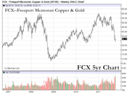
In the initial throes of the credit market induced selloff in October 2008, certain asset classes sold off quickly with sharp declines: Emerging Market (EM) equities and debt, commodities (especially copper, gold and oil). During the month of September 2011, we've seen a similar sharp selloff in these asset classes, minus commensurate participation from oil (so far). The declines in copper have come with speculation that China and other major copper holders are dumping copper onto the open market, creating selling pressure, in anticipation of a slowdown in Chinese housing and manufacturing growth.

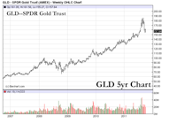
If these selloffs are a true reflection of a coming global slowdown, then we may anticipate lower lows in copper (a futures curve asymptote to $2 and the equity proxy FCX below $20) as well as EM equities (VWO proxy $20 range). Though oil has not participated for a variety of reasons, it too could follow, leading to sharp declines in the majors and the commodity. Gold may be the exception again this time — it reached a relative low October 24, 2008, and rebounded from there, never looking back.

The flip side is that what we are seeing is a head fake, created by selling pressure from hedging activity.

The question then becomes: what are the catalysts to sharp market reversals to the upside with a sustained rise? European debt restructuring is a foregone conclusion, and may not lead to significant sustenance, given the debt levels involved and the uncertainty and disorder within the EU in general. Another quantitative easing binge by monetary authorities may give a lift, but as we've seen, the result leads to an uptick in commodity inflation mixed with stale real growth, while promoting continued debt accumulation and preventing debt deleveraging. Negative real interest rates and economic uncertainty from regulatory, tax and fiscal policies are hampering private investment.

Given this outlook, continued volatility is the most likely outcome. Hiding out in the Treasury and muni markets may not be a panacea, given the negative real returns and the latent risks. As commodities, equity majors and proxies reach lower lows, their attractiveness to acquire and hold rises, given the probability of continued inflation growth. Disinflation from debt deleveraging (while it is allowed to occur!) provides significant opportunities.

Thursday, September 22, 2011

Valuing Gold From Inflation and Money Supply Growth Rates

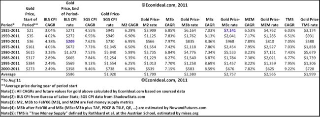
GoldEstCAGR

How much is gold worth? Is gold in a bubble? Is it undervalued, even at $1900/oz? Is the current selloff providing a buying opportunity or a reason to sell? How can we tell?

One way to value gold is to look at long-term compounded annual growth rates (CAGRs) in inflation and money supply metrics, and use those rates to calculate the future value (FV) of gold from some traded price level in the past. Since I have not seen this type of analysis anywhere, it seemed germane and useful, as gold demand in terms of traded price level responds to both inflation and money supply growth, among other factors. Not surprisingly, inflation and money supply metrics grow at different rates over different time periods, due to ebbs and flows of economic activity and Federal Reserve (Fed) monetary policy.

The table above lists CAGRs of two inflation metrics, the consumer price index (CPI) levels reported by the Bureau of Labor Statistics (BLS) and the pre-1983 BLS CPI reported by ShadowStats.com ("SGS CPI") [1]. Also shown are CAGRs for five broad money supply metrics, M2, M3 (and M3b, which is M3 calculated by other sources [2] after the Fed discontinued its M3 series in early 2006), M3c [2], MZM, and TMS [3].

The results: Gold's Aug 2011 FV based on inflation rates range from $209-$5840, and based on broad money supply growth rates range from $539-$7141. Taking a closer look, the lows of these ranges stem from a relative market low price level at the start of the compounded period, namely 1970, when gold was artificially kept at a $35 peg (the market trading price level was slightly higher, $36), and 2000, which represented a decades market low for numerous commodities such as oil and gold, due to an exceptionally stronger dollar from a short-covering rally. The consistently low FVs based on the BLS CPI CAGR, $209-$1673, can probably be thrown out, given the specious definition for the metric after 1983 [1]. That leaves a FV range of $539-$7141. The averages over all of the FVs from this set span from $1709-$2757.

As one might expect, the wider ranges for gold FVs come from the money supply metrics, especially M3c, which contains the significant effects from recent Fed monetary stimuli programs, 2007-present. M3c ~ $17.32Trillion as of Aug 2011 [2], well exceeding nominal GDP ~$14.5T. Perhaps most telling is the FV range from long-term gold price appreciation since 1925: $3174-$7141. The lower bracket here is provided by the FV from the SGS CPI inflation rate, $945.

A few notes on the growth rates. The highest rates come from SGS CPI growth from 2000-2011 and 1995-2011 (yet we were told by the gov't and the Fed that inflation was exceedingly low over these periods!), M3c from 1995-2011 (thanks to "special" Fed monetary stimulus programs), and TMS from 2000-2011. Growth in the latter, TMS, is interesting, as TMS differs from the other metrics through its inclusion of Fed special memorandum data in its monetary aggregates database that many argue should be construed as money substitutes, while it excludes less liquid substitutes that have shown downside volatility from financial instability.

This analysis provides a realization that if gold buyers specify demand through price based on historical inflation and money supply growth, gold FV price levels can easily exceed where it is currently trading, and we have a concrete series of FV price levels to measure from.

Gold buyers should keep in mind that as we have gold sell off sharply on days such as today, Sept 22, 2011, that the selloff is driven largely by margin calls as all price levels fall in a volatile trading session in the broader commodities futures and equities markets, i.e., there is sharp deleveraging leading to forced selling. If gold's long-term trend is motivated by inflation and money supply growth rates that we have outlined here, that provides a floor for the traded gold price, as the expectation is that the Fed will continue its monetary stimulus measures as the dollar strengthens and the commodity and equity markets wane.

Author's Note, 9/23/2011: As the metals market continues sharp declines on a second day of volatile trading, gold closes at ~$1643, some 13.3% below the average high close of $1895 on 9/6/2011. Gold would have to go down to ~$1335 from this average high close to equal the peak-to-trough decline experienced in 2008 (~29.5%: $1011 on 3/17/2008 down to $712.50 on 10/24/2008), a recent period of comparative selling. On a longer scale, gold selloffs exceeding the 2008 decline occurred between 1980-1982 (~65.1%: $850 on 1/21/1980 down to $297 on 6/18/1982) and 1983-1985 (~44.2%: $509 on 2/15/1993 down to $284 on 2/25/1985). A 65% decline from $1900 is $663, below the lowest low of the FVs based on the SGS CPI CAGR shown in the above table. The 2008 and 1980-82 declines resulted in sharp reversals, while the 1983-1985 decline didn't yield any significant price appreciation until gold hit a multi-decade low in July 1999 ($252) after meandering around a average price of $355 (sigma ~ $52) between 1985-2004, before taking off in 2005.

[1] The SGS CPI mimics the inflation metric reported by the BLS before 1983. Starting in 1983, the BLS CPI was changed to de-emphasize food and energy inflation and allow for hedonic adjustments and substitutions, among other changes. The SGS CPI tracks the original definition, which maintains a measure of the cost of living needed to maintain a constant standard of living. HERE is a great article discussing just how misleading the current BLS CPI is. 
[2] M3b is estimated by NowandFutures.com HERE. M3c is essentially M3b on steroids: it includes the money supply growth estimated from the Fed's various special liquidity and monetary easing programs since 2007, namely TAF, PDCF & TSLF, QE,... .
[3] TMS is "true money supply," which is M2 minus small time deposits and retail/institutional money funds, plus demand and time/savings deposits due to foreign banks/institutions, U.S. gov't demand/note balances at banks and depositories, and U.S. gov't general account balances at the Fed. TMS seeks to track standard money plus money substitutes ("perfectly secure and immediately convertible, par value claims to standard money"). Up-to-date TMS is tracked HERE. Whether TMS is better and more accurate than M2 or M3 or MZM at tracking broad money supply will be discussed in a later article.


Thursday, September 15, 2011

Global Debt Watch: $95T and Counting

TotalMktDebt BIS Dec 89 Dec 10

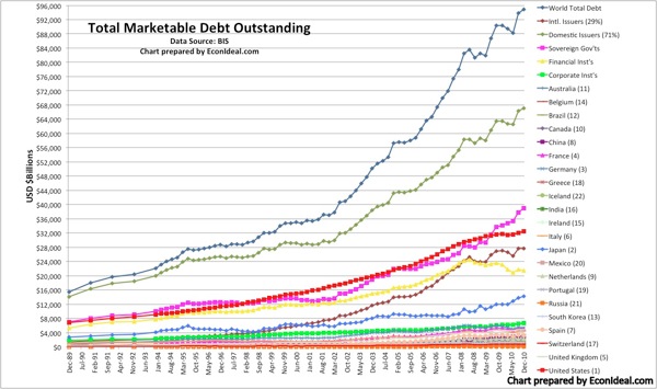
As of Dec 2010, worldwide marketable/tradable debt outstanding neared some USD$95Trillion, according to the Bank of International Settlements (BIS). The historical data above indicates that debt markets have more than doubled from Dec 2002 to Dec 2010, with the largest increases stemming from domestic issuances, at first (2002-2007) from mortgage and asset-backed security issuances, and then more recently (since 2008), from sovereign government issuances. The United States maintains the largest debt market, at some $32.5T, ~35% of the worldwide total market [1].

Gauging and tracking marketable/tradable debt is key to understanding global capital market stability. Though total debt levels can also contain "nonmarketable" debt, such as nonmarketable sovereign government debt, it is the marketable debt that has the greater systemic influence across debt, equity and derivatives markets, since market participants price and trade that debt; however, the influence of nonmarketable debt levels should not be understated. I have started to maintain a "Global Debt Watch" page HERE, with the intent of providing historical trends and data analysis at regular intervals from a variety of international sources.

The fantastic growth in the debt markets has been assisted by three primary factors: (a) the reduced borrowing costs made possible by central bank monetary easing policies worldwide; (b) the aggressive use of short-term funding markets, such as the repurchase agreement (repo) and commercial paper (CP) markets, to borrow cash short and buy longer-dated, higher-yielding debt; (c) government policies that promote debt issuance, and government-sponsored entities (GSEs) that "back" such issuances. Government sanctioned credit rating agencies have also been a factor in the growth of debt markets.

The growth and decline of the repo and CP markets in the last decade coincide with that of the growth and decline of mortgage and asset-backed securities (MBS/ABS) and collateralized debt obligations (CDOs), structured pools of MBS/ABS. The total repo market size between the two largest markets, U.S. and Europe, stood at approximately $12.6T Dec 2010, after falling from a 2008 high of $17.5T [2]. Unlike the CP markets, the repo markets are not reported in the BIS debt data above; repo markets are (usually) very fluid, with the majority of transactions composed of overnight or very short-term maturities. The relative opacity of repo markets, plus their vulnerability to liquidity issues due to collateral quality, counterparty risk and capital cushions, make tracking these markets imperative to gauging stability and "systemic risk." Conceivably, the more transparency in the repo markets, the better able the system would be to handling (greater) market liquidity dislocations, such as that experienced from the credit crisis of 2007/8. However, such transparency does not solve the problem of debt accumulation sponsored by central bank monetary and sovereign government fiscal policies.

[1] The Securities Industry and Financial Markets Assoc. (SIFMA) estimates U.S. debt markets at $35.5T, ~37% of the total worldwide market. SIFMA includes offshore centers and CDOs issued in USD.
[2] I assembled these estimates from two sources, the NY Federal Reserve (Fed) and the International Capital Market Association (ICMA). The NY Fed data only reports primary dealer repos, from a survey of Fed primary dealers, and does not count private OTC repos handled by bank holding companies. That may likely increase the U.S. total by some 30%, according to BIS.


Global Derivatives Watch: Netting, Collateral and Capital Cushions Matter

DerivMkt BIS Dec 87 Dec 10

In an attempt to demystify the derivatives markets, which have endured an abundancy of malign from both somewhat credible and uninformed critics, I have started to maintain a "Global Derivatives Watch" page HERE, with the intent of providing historical trends of these complex markets along with data analysis at regular intervals. Not only do I trade these markets (namely the options, futures and forex markets), but I see enormous value in derivatives to (a) hedge risks with a defined loss and (b) place bets with a defined loss, when structured properly and controlled with defendable margins and prudent capital controls.

The first fallacy that pervaded the derivatives markets, only to lead to the road to ruin for certain participants in these markets, was that there was ever such a construct as "risk free." Let me assure you that there is nothing of the sort. The second fallacy was that due diligence was not necessary on the derivatives counterparties with which a participant executes a trade, particularly of the sort that includes high leverage or risky collateral, and also particularly on custom over-the-counter (OTC) contracts that don't trade through a clearinghouse or on an exchange. Most equity, futures and forex options and forwards trade on exchanges and have benefitted from the transparency and liquidity. Nearly half of all interest rate swaps (IRS), the largest derivatives market by almost an order of magnitude over all the others in terms of gross market exposure, are cleared through a central clearinghouse, where netting and collateral control can be verified. To be sure, there are many specialized, one-off OTC derivatives that will still be executed between parties directly or through a dealer, but that doesn't minimize the importance in netting, monitoring of underlying or backing collateral quality and value, and capital cushions should a trade go south. (The poster child for failure to execute these tenants is AIG, which should have never been bailed out for its incompetence and risk mismanagement.)

As I like to say, derivatives don't bankrupt people, people bankrupt people. (Sound familiar?)

As the chart above shows, the derivatives markets have grown exponentially over the last two decades, signifying the demand for the ability to hedge and define risks. Much of this demand is due to heightened risks in markets that result from uncertainties in macroeconomic factors, such as interest rate risk, foreign exchange rate risk, systemic default/credit risk, and futures curve (commodity price) risk. Though the credit default swaps (CDS) markets have taken the brunt of the criticisms from an array of punditry, and have spawned one too many sensational bestsellers filled with overblown rhetoric, these instruments do serve a purpose in hedging both macro and microeconomic risks, particularly specific to securities, indexes of securities, companies, institutions and governments.

Just so I don't come off as a rep for one of the industry or lobby groups for derivatives, I will provide my own criticisms of the derivatives markets thus: not everything is known about these markets to gauge systemic stability in the event of gross risk shocks (dislocations) that in turn might bring about market liquidity issues (i.e., selling panic) and lead to serious market degradation and inadvertent losses. Of particular interest is the study of interest rate swaps when rates correct markedly higher or experience extreme volatility, as a result of market panic and inviting more market panic. Understanding the vulnerabilities in markets (not just derivatives, but also equity and debt/bond markets) is valuable and the role of market transparency, disclosure and visibility critical to the task.


Wednesday, August 24, 2011

A Tale of Two "Safe Havens"

Treasury10vsGold

As gold sells off sharply today after hitting a nominal intraday high of $1911.46 yesterday, a reminder of the global fiscal and monetary events that powered gold up into this point is useful. The attached chart shows the path of gold compared to another "safe haven," the US 10-year Treasury note (normalized price, inverse yield). Both have a story to tell, and both reflect market uncertainty on issues of inflation, deflation, debt loads and economic growth.

During the fall 2008 market turmoil created by the credit and housing market crises, investors and traders piled into Treasuries and the dollar, while gold sold off in a technical basing pattern. As markets recovered in 2009 due to massive Federal Reserve injections of monetary liquidity (including "QE1"), gold climbed above its previous high of $1011.30 hit March 17, 2008 (the day Bear Stearns died). Fed liquidity drove a selloff of Treasuries and the dollar, with money flowing into equities, commodities and gold.

The late April 2010 flare up of the European sovereign debt crisis from fears of defaults from Greece, Portugal and Ireland sparked a "safe haven" trade into US Treasuries from May-August. In the same period, gold rose less steadily, but put in what market trading technicians call an important "base" by weeding out short-term sellers from the long-term buyers. Gold resumed its climb briskly from $1200-$1400 on inflation expectations following Bernanke's Jackson Hole speech, where he announced Fed plans for more monetary liquidity injections.

Like gold today, the 10-year Treasury has had its woes, namely a brisk selloff after the Fed embarked on its "second" round of quantitative easing last year (QE2). [By highlighting "second" I mean to dispel the idea that this was really a "second" round — the Fed engages in quantitative easing continuously through its permanent open market operations (POMO).] When inflation expectations heat up, the prospect of negative real yields prompts a selloff of lower yielding Treasuries into commodities and higher yielding equities and bonds, as evidenced by market action between September 2010-April 2011. Markets were also expecting real economic growth, but an alternate reality has since crept into market psyche.

As the European debt crisis flared again alongside US debt concerns in April-June 2011, investors chose both Treasuries and gold as "safe havens," and they have been remarkably correlated ever since. The acceleration of the trend throughout the US debt ceiling blowoff, S&P US credit downgrade and the Fed's declaration of a 2-year moratorium on zero target interest rates (ZIRP) should give observers pause. Is this a rational market or an irrational search for economic sanity?